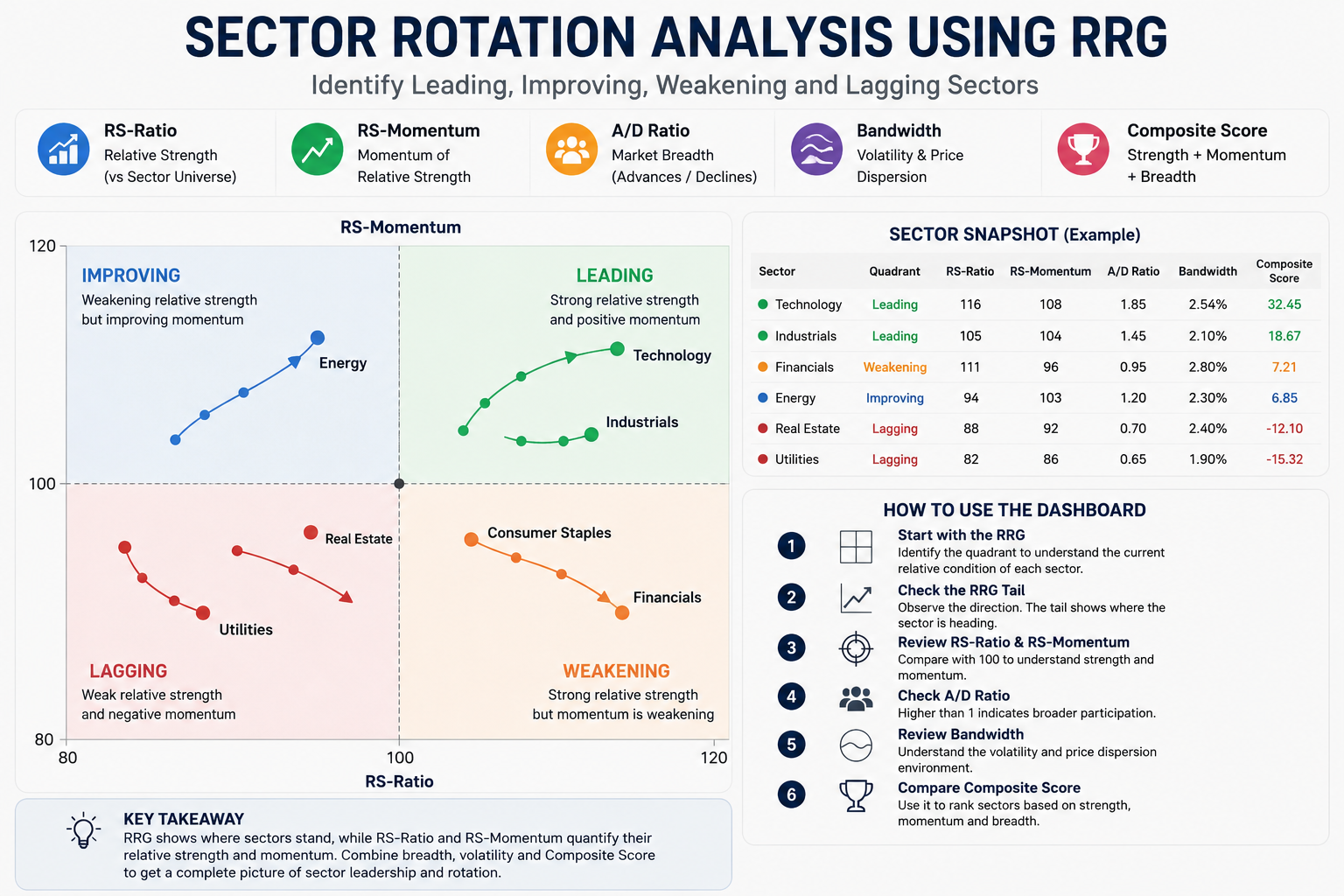
Sector Rotation Analysis Using RRG: How to Identify Leading & Improving Sectors
Markets do not always move together. Different sectors can lead the market at different times, while some sectors lose strength or begin to recover.
This changing leadership between sectors is known as sector rotation.
Sector Rotation Analysis helps us understand which sectors are currently strong, which are losing momentum, which are improving and which are lagging.
Our Sector Rotation Dashboard uses Relative Rotation Graphs (RRG) along with relative strength, momentum, market breadth, volatility and Composite Score to make this analysis easier.
What Is Sector Rotation?
Sector rotation is the movement of market leadership from one sector to another over time.
For example, Technology may outperform other sectors during one period. Later, Financials or another sector may start gaining relative strength while Technology begins to weaken.
Instead of looking only at whether a sector's price is increasing, sector rotation analysis asks:
- Which sectors are outperforming?
- Which sectors are losing relative strength?
- Which sectors are starting to improve?
- Which sectors are currently lagging?
- Is the sector movement supported by its constituent stocks?
This provides a broader view of market leadership than looking at individual sector price changes alone.
Why Use Sector Rotation Analysis?
A sector can increase in price and still underperform other sectors.
Sector rotation analysis focuses on relative performance, making it easier to compare multiple sectors using the same framework.
For example, if two sectors are both rising, but one is gaining relative strength while the other is losing momentum, simply looking at their price charts may not clearly show this difference.
The Sector Rotation Dashboard brings these relative changes together so that users can quickly identify where market strength is concentrated and where leadership may be changing.
What Concepts Are Used?
The Sector Rotation Dashboard combines several concepts to evaluate sector strength, momentum and participation.
Relative Strength
Relative Strength compares a sector's performance with the overall sector universe.
It helps answer:
"Is this sector performing better or worse than other sectors?"
RS-Ratio
RS-Ratio represents the relative-strength condition of a sector.
100 is the neutral level.
- Above 100 → stronger relative strength
- Below 100 → weaker relative strength
RS-Momentum
RS-Momentum shows whether the sector's relative-strength condition is improving or weakening.
100 is the neutral level.
- Above 100 → relative momentum is improving
- Below 100 → relative momentum is weakening
Market Breadth
Market breadth helps determine whether the sector's movement is supported by a broader group of constituent stocks.
The dashboard uses the Advance/Decline (A/D) Ratio:
A/D Ratio = Advances / Declines
- Above 1 → more stocks are advancing
- 1 → advances and declines are balanced
- Below 1 → more stocks are declining
EMA Bandwidth
EMA Bandwidth provides additional information about the volatility environment.
- Increasing bandwidth → volatility and price dispersion are expanding
- Decreasing bandwidth → volatility and price dispersion are contracting
Bandwidth provides volatility context and does not independently determine whether a sector is bullish or bearish.
Composite Score
The Composite Score combines relative strength, momentum and breadth into a comparative ranking.
It can be used to compare sectors and identify sectors showing a stronger combination of these characteristics.
The Composite Score is a ranking metric, not a standalone buy or sell signal.
What Is a Relative Rotation Graph (RRG)?
A Relative Rotation Graph (RRG) is a visual way to compare sectors based on relative strength and relative momentum.
The RRG uses:
- X-axis: RS-Ratio
- Y-axis: RS-Momentum
The neutral point is 100 / 100.
Based on these two values, each sector falls into one of four quadrants.
The Four RRG Quadrants
Leading
RS-Ratio ≥ 100 and RS-Momentum ≥ 100
The sector has strong relative strength and positive relative momentum.
This represents established sector leadership.
Weakening
RS-Ratio ≥ 100 and RS-Momentum < 100
The sector is still relatively strong, but its momentum is weakening.
This can indicate that an existing sector leader is beginning to lose momentum.
Lagging
RS-Ratio < 100 and RS-Momentum < 100
The sector has weak relative strength and negative relative momentum.
This represents the weakest RRG state.
Improving
RS-Ratio < 100 and RS-Momentum ≥ 100
The sector is still below the relative-strength neutral level, but its momentum is improving.
This can indicate that a previously weaker sector is beginning to recover.
How to Use the Sector Rotation Dashboard
The Sector Rotation Dashboard should be read from the overall RRG position first and then through the supporting metrics.
A practical reading order is:
RRG Quadrant → RRG Tail → RS-Ratio → RS-Momentum → A/D Ratio → Bandwidth → Composite Score
Each step provides a different piece of information about the sector.
Step 1: Start With the RRG
Begin by looking at the RRG chart and identify where each sector is positioned.
The quadrant gives you the sector's current relative condition.
- Leading → strong relative strength and positive momentum
- Weakening → strong relative strength but weakening momentum
- Lagging → weak relative strength and negative momentum
- Improving → weak relative strength but improving momentum
This gives you a quick high-level view of sector leadership across the market.
For example, if several sectors are positioned in Leading, those sectors currently have stronger relative conditions than sectors positioned in Lagging.
Step 2: Look at the RRG Tail
After identifying the quadrant, look at the sector's RRG tail.
The current position tells you where the sector is, while the tail helps show how the sector has been moving.
This is important because two sectors can be in the same quadrant but moving in completely different directions.
- Up-right → relative strength and momentum are improving
- Down-right → relative strength remains strong, but momentum is weakening
- Down-left → relative strength and momentum are deteriorating
- Up-left → momentum is improving while relative strength is still weak
For example, a sector in Leading and moving further toward the upper-right may show stronger continuation of its current leadership.
A sector in Leading but moving downward toward Weakening requires more attention because its momentum is beginning to deteriorate.
Step 3: Check RS-Ratio
Next, check the sector's RS-Ratio.
100 is the neutral level.
- Above 100 → stronger relative-strength condition
- Below 100 → weaker relative-strength condition
RS-Ratio helps answer whether the sector currently has a stronger or weaker relative position compared with the reference condition.
A sector with an RS-Ratio significantly above 100 has a stronger relative-strength condition than a sector that remains below 100.
Step 4: Check RS-Momentum
After checking relative strength, look at RS-Momentum.
100 is the neutral level.
- Above 100 → relative momentum is improving
- Below 100 → relative momentum is weakening
RS-Momentum is particularly useful for identifying changes in sector leadership.
For example:
- A sector with RS-Ratio above 100 and RS-Momentum above 100 is in Leading.
- A sector with RS-Ratio above 100 but RS-Momentum below 100 is in Weakening.
- A sector with RS-Ratio below 100 but RS-Momentum above 100 is in Improving.
This helps distinguish between established strength and emerging improvement.
Step 5: Check A/D Ratio for Participation
Once you understand the sector's RRG position, check the A/D Ratio.
The A/D Ratio helps determine whether the sector's movement is supported by a broader group of constituent stocks.
For example:
A/D Ratio = 12 / 6 = 2
This means there are twice as many advancing stocks as declining stocks.
- A/D Ratio > 1 → more stocks are advancing
- A/D Ratio = 1 → advances and declines are balanced
- A/D Ratio < 1 → more stocks are declining
A sector in Leading with supportive breadth can provide stronger participation context than a sector whose relative strength is being supported by only a small number of constituents.
However, breadth should be used as supporting information rather than as a standalone signal.
Step 6: Check Bandwidth
Next, check EMA Bandwidth to understand the volatility environment.
- Increasing bandwidth → price dispersion and volatility are expanding
- Decreasing bandwidth → price dispersion and volatility are contracting
Bandwidth does not tell you whether a sector is Leading, Improving, Weakening or Lagging.
Instead, it provides additional context about how much price dispersion is currently present in the sector.
This can help users understand whether the sector is moving in a relatively compressed environment or a more volatile environment.
Step 7: Compare the Composite Score
Finally, use the Composite Score to compare sectors.
The Composite Score combines relative strength, momentum and breadth into a comparative ranking.
This can be particularly useful when several sectors are in similar RRG quadrants.
For example, if multiple sectors are in Leading, the Composite Score can provide another way to compare their overall relative characteristics.
It should be treated as a ranking tool rather than a standalone trading signal.
How to Combine the Metrics
The most useful way to use the dashboard is to avoid looking at any single metric in isolation.
For example, consider the following situations:
Leading + positive tail + A/D Ratio above 1
This represents a sector with established relative strength, improving movement and broader participation.
Improving + positive momentum
This can indicate a sector that is beginning to recover even though its RS-Ratio has not yet moved above 100.
Weakening + downward movement
This can indicate that an established leader is losing relative momentum.
Lagging + negative momentum
This represents a sector with weak relative strength and momentum.
The purpose of combining these metrics is to understand the context and direction of sector leadership, rather than making a decision based on one number.
Example of Using the Dashboard
Suppose you are reviewing the RRG and notice that a sector is positioned in the Leading quadrant.
You can then follow the dashboard reading process:
- Confirm that RS-Ratio is above 100.
- Confirm that RS-Momentum is above 100.
- Check whether the RRG tail is moving further up and to the right or beginning to turn downward.
- Check the A/D Ratio to see whether constituent participation is broad.
- Check Bandwidth to understand the current volatility environment.
- Compare the Composite Score with other sectors.
This gives you much more information than simply knowing that the sector is classified as Leading.
What to Look for When Comparing Sectors
When comparing sectors, focus on the combination of position, direction and participation.
A sector in Improving may be worth watching because its momentum is beginning to strengthen.
A sector in Leading may represent established strength, but its tail should still be monitored for signs of weakening.
A sector in Weakening may still have strong relative strength, but declining momentum can indicate that leadership is losing strength.
A sector in Lagging represents weaker relative conditions and may require evidence of improvement before its position changes.
This approach allows the dashboard to be used not only for identifying current leaders but also for monitoring changes in sector leadership.
Simple Example
Suppose a sector has:
- RS-Ratio = 120
- RS-Momentum = 110
- Advances = 12
- Declines = 6
Because both RS-Ratio and RS-Momentum are above 100, the sector is in the Leading quadrant.
Its A/D Ratio is:
12 / 6 = 2
This indicates that more constituent stocks are advancing than declining, providing additional participation context.
If the RRG tail is also moving toward the upper-right, the sector's relative strength and momentum are improving together.
Conclusion
Sector Rotation Analysis provides a structured way to understand changing market leadership.
The RRG shows where sectors are positioned, while RS-Ratio and RS-Momentum help explain their relative strength and momentum.
A/D Ratio provides participation context, EMA Bandwidth provides volatility context, and the Composite Score helps compare sectors.
The key is to read these metrics together:
Quadrant → Tail → RS-Ratio → RS-Momentum → A/D Ratio → Bandwidth → Composite Score
By following this approach, the Sector Rotation Dashboard can help identify leading, improving, weakening and lagging sectors while providing a clearer view of how market leadership is changing.
Sector rotation is not simply about finding which sector is going up. It is about understanding which sectors are leading, which are losing strength, which are improving and how their relative position is changing over time.
Important Note
Sector rotation analysis is an analytical framework and should not be treated as a guaranteed trading signal. Market conditions can change rapidly, and no indicator, ranking system or analytical model can guarantee future performance. This content is for informational purposes only and does not constitute investment advice. Always conduct your own research and risk assessment before making investment decisions.